R analysis with sf
tstartsf <- Sys.time()
library(tidycensus)
library(htmltools)
library(sf)
library(tidyverse)
library(magrittr)
library(geojsonsf)
library(ggplot2)
library(rmapshaper)
library(tigris)

knitr::opts_chunk$set(echo = TRUE, warning = FALSE)
In the first analytic example, we use R with the packages tidycensus to obtain census block group data, tigris for water areas, and sf and rmapshaper for analysis to estimate for Seattle neighborhoods some demographic characteristics available at the block group level.
See basic usage of tidycensus.
To reproduce this example you need a census API key!
1 Import data to R data frames
1.1 Block group data
The following code chunk downloads and reformats some block group data for King County.
# load variables for looking and selecting
# l <- load_variables(year = 2021, dataset = "acs5", cache = TRUE) # only needed for devel.

# get the data
bg <- get_acs(
    geography = "block group",
    variables = c(
        pop_total = "B01003_001",
        pop_white = "B02001_002",
        pop_income_below_pov = "B17010_002",
        pop_ed_lt_hs = "B28006_003"
    ),
    year = 2020,
    state = "WA",
    county = "King",
    geometry = TRUE,
    output = "wide",
    progress_bar = FALSE,
    show_call = TRUE
) %>%
    select(-NAME)

# rename some columns
names(bg) %<>% str_replace_all(pattern = "E$", replacement = "") %>% str_to_lower()

# nonwhite population
bg %<>% mutate(
    pop_nonwhite = pop_total - pop_white,
    pct_white = (pop_white / pop_total * 100) %>% round(1),
    pct_nonwhite = (pop_nonwhite / pop_total * 100) %>% round(1),
    pct_below_pov = (pop_income_below_pov / pop_total * 100) %>% round(2)
)

# project
bg %<>% st_transform(26910)

# area
bg %<>%
    mutate(area_m_bg_orig = st_area(.) %>% as.numeric())
Let’s take a quick look at the block groups (Figure 1.1).
bg %>% ggplot() +
    geom_sf()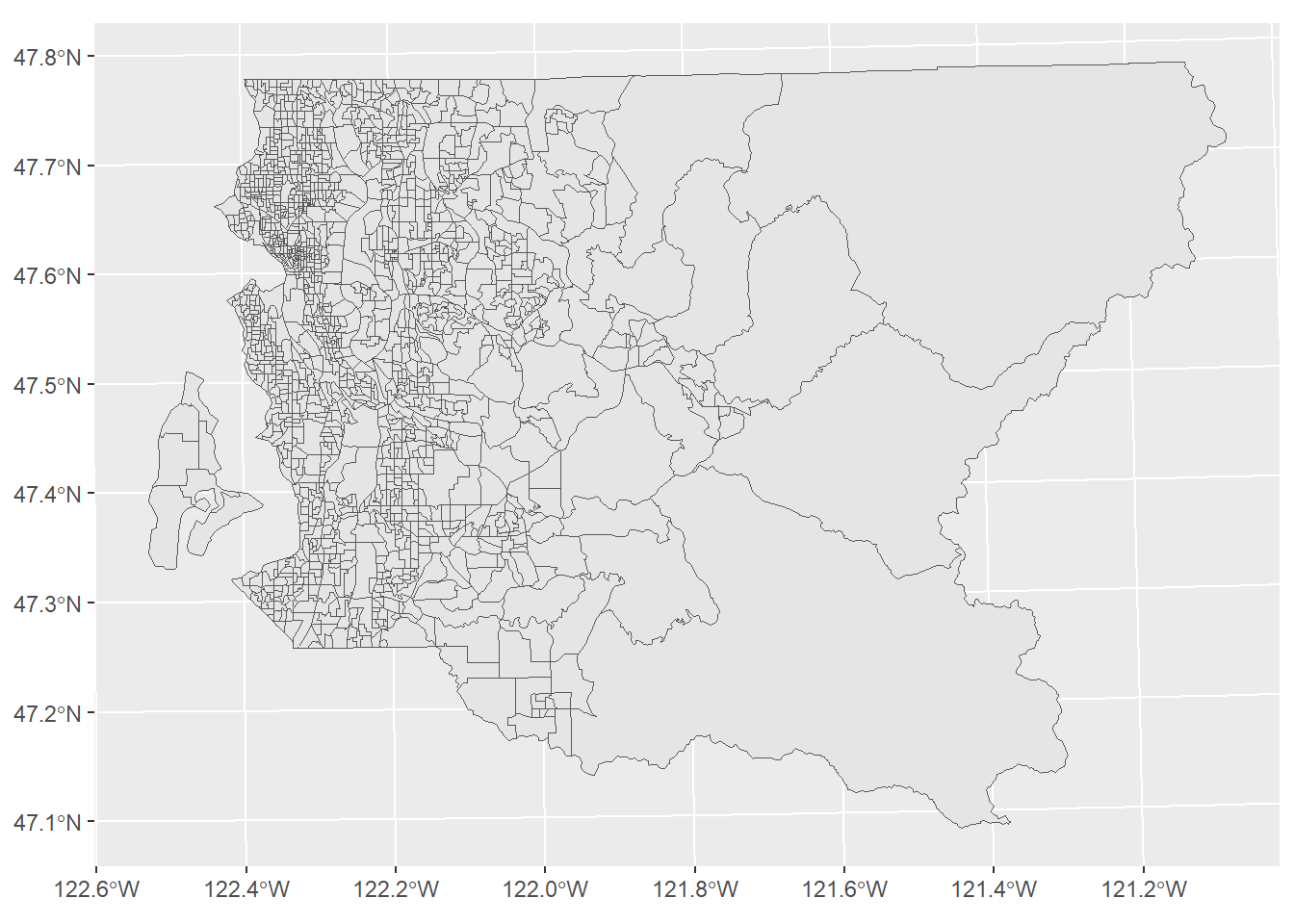
Figure 1.1: Block groups
Here we can see a histogram of the data (Figure 1.2), the count of block groups by percent non-white.
bg %>% arrange(pct_nonwhite) %>% ggplot(mapping = aes(x = pct_nonwhite)) +
    geom_histogram(bins = 100) +
    xlab("% nonwhite") +
    ylab("count of block groups")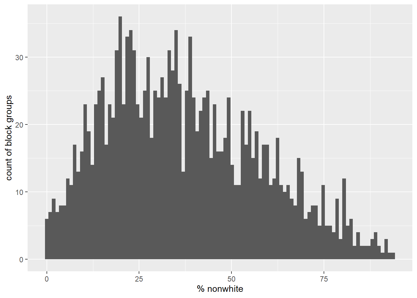
Figure 1.2: Percent nonwhite
1.2 Water areas data
In order to perform the area weighting correctly, we need to measure area of block groups with water areas subtracted. One option is to download the US Census block group shape files and use the ALAND column. This would need to be a separate step from using tidycensus. Rather, we will download the water areas as a separate data set so we can also have visual confirmation that our analyses pass a reality check.
The water areas are shown in Figure 1.3.
w <- area_water(state = "WA", county = "King", year = 2021, progress_bar = FALSE,
) %>%
    st_transform(26910)

w %>% ggplot() +
    geom_sf(fill = "cyan", color = "cyan")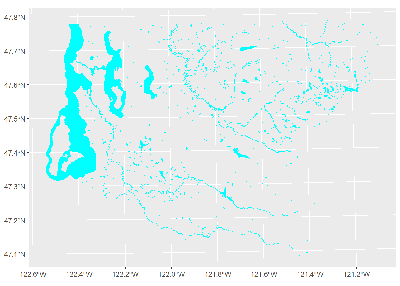
Figure 1.3: King County water areas from US Census TIGER/Line data
Water areas will be erased using rmapshaper::ms_erase(), with results shown in Figure 1.4.
bg_nowater <- ms_erase(target = bg, erase = w, remove_slivers = TRUE)

bg_nowater %>% ggplot() +
    geom_sf()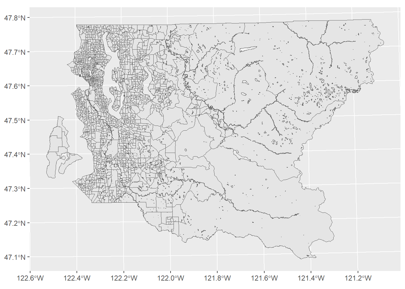
Figure 1.4: King County block groups with water areas erased
1.3 Neighborhood areas data
Next we download the Seattle OpenData neighborhoods and convert from GeoJSON format to a sf polygon data set on the fly. We also make a simple plot of the neighborhood boundaries (Figure 1.5).
nhood <- geojson_sf("https://opendata.arcgis.com/api/v3/datasets/b76cdd45f7b54f2a96c5e97f2dda3408_2/downloads/data?format=geojson&spatialRefId=4326&where=1%3D1") %>%
    st_transform(26910)

names(nhood) %<>% str_to_lower()

nhood %>% ggplot() +
    geom_sf()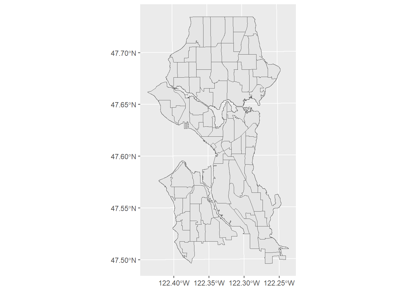
Figure 1.5: Seattle neighborhoods
We demonstrate that the data align (Figure 1.6).
ggplot() +
    geom_sf(data = bg) +
    geom_sf(data = nhood, color = "cyan", fill = NA)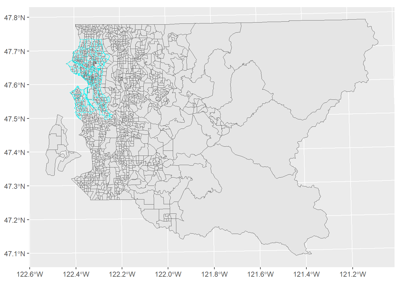
Figure 1.6: King County block groups and Seattle neighborhoods
2 Overlay analysis
Lastly, we will perform the overlay. The area weighting is performed using simple arithmetic based on clipped and original block group area, e.g.,
\(pop_{estimate} = pop_{orig} \times \frac{area_{clip}}{area_{orig}}\)
and group percentages by
\(pct_{group} = \frac{pop_{group}}{pop_{total}} \times 100\%\)
using the calculated population count estimates.
In pseudocode:
- union Seattle neighborhoods to generate a polygon to select block groups for a faster intersect
- select block groups intersecting the Seattle outline
- intersect block groups and neighborhoods
- dissolve by neighborhood name
- calculate count estimates and percentages based on area weighting
# timing
t0 <- Sys.time()
# union all nhood polygons for selecting BGs
nhood_u <- st_union(nhood) %>% st_as_sf

# select those BGs that intersect with the boundary
bg_lim <- bg_nowater %>% mutate(intx = st_intersects(bg_nowater, nhood_u, sparse = FALSE)) %>%
    filter(intx)

# perform the intersection and calculate some columns
dat_intx <- st_intersection(bg_lim, nhood)

# recalculate, select columns
dat_intx %<>%
    mutate(area_m_bg_clip = st_area(.) %>% as.numeric(),
           area_prop = area_m_bg_clip / area_m_bg_orig,
           pop_total_x = pop_total * area_prop,
           pop_white_x = pop_white * area_prop,
           pop_nonwhite_x = pop_nonwhite * area_prop,
           pop_income_below_pov_x = pop_income_below_pov * area_prop,
    ) %>%
    filter(s_hood != " ")

# aggregate
bg_nhood <- dat_intx %>%
    # aggregate to neighborhood
    group_by(s_hood) %>%
    # sum population estimates
    summarise(
        pop_total = sum(pop_total_x),
        pop_white = sum(pop_white_x),
        pop_nonwhite = sum(pop_nonwhite_x),
        pop_income_below_pov = sum(pop_income_below_pov_x)) %>%
    # calculate percentages
    mutate(
        pct_white = (pop_white / pop_total * 100) %>% round(1),
        pct_nonwhite = (pop_nonwhite / pop_total * 100) %>% round(1),
        pct_income_below_pov = (pop_income_below_pov / pop_total * 100) %>% round(2)
    )
atime <- difftime(Sys.time(), t0, units = "secs") %>% as.numeric %>% round(2)
[The overlay analysis using R methods took 4.36 seconds.]
Figure 2.1 shows a simple map with the area-weighted estimate of the percent of residents below poverty.
bg_nhood %>% ggplot() +
    geom_sf(aes(fill = pct_income_below_pov)) +
    labs(fill = "% below\npoverty")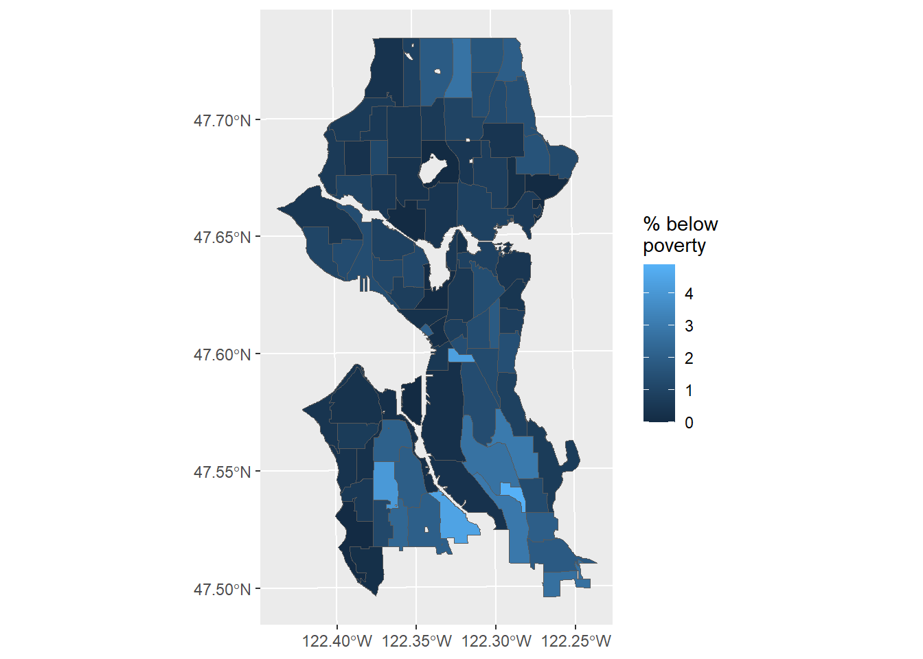
Figure 2.1: Estimate of percent below poverty in Seattle neighborhoods
sfrendertime <- difftime(Sys.time(), tstartsf, units = "secs") %>% as.numeric %>% round(2)Total render time with R sf: 38.74 seconds.